Hello.
I’m a freelance graphic designer with over twenty-five years of industry experience. Working with a variety of clients, I develop ideas, create illustration and artwork, and manage production. Get in touch for samples of work or to discuss a potential project.

The Royal Marsden // Illustration
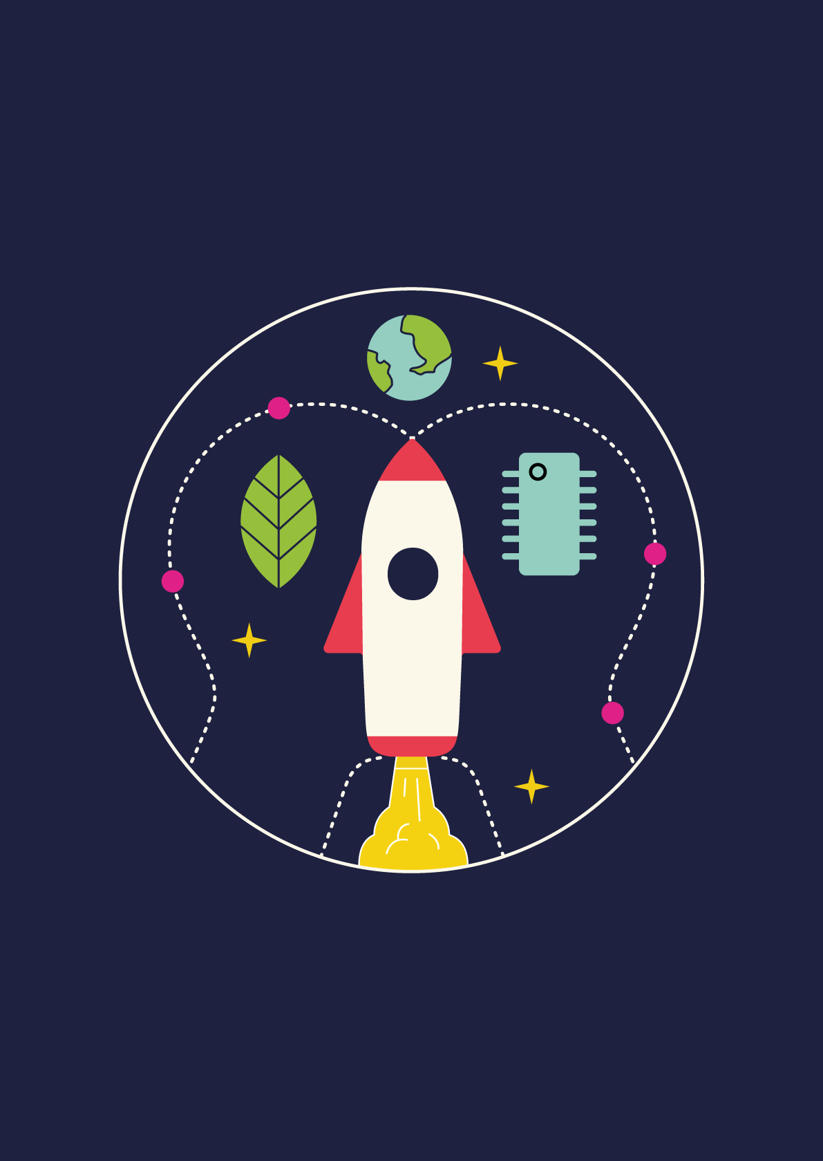
Planet Compassion // Illustration

Fly Culture Magazine // Typography
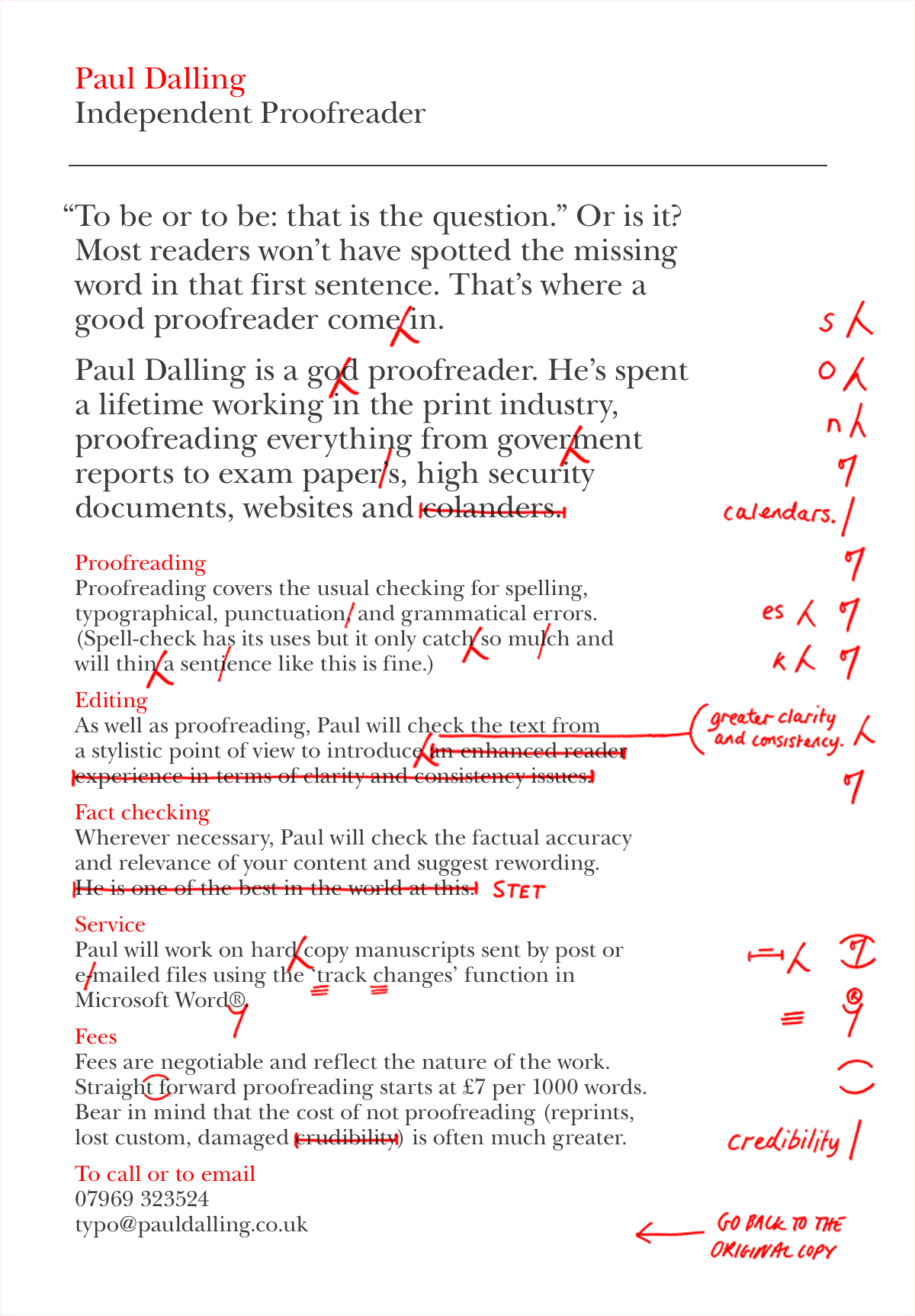
Paul Dalling Proofreader // Graphic Design

HNNA Architects // Typography

Optima Education // Illustration
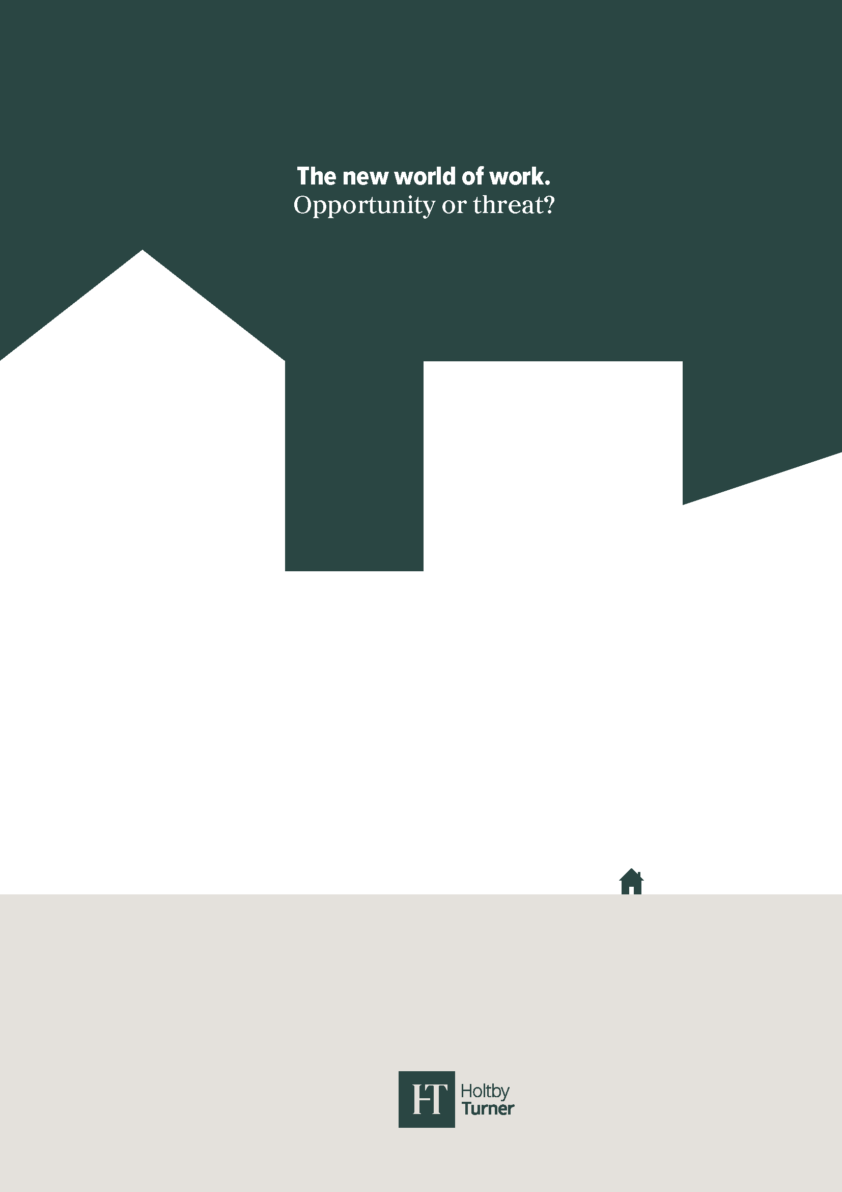
Holtby Turner // Graphic Design

St Bride Foundation // Identity

Architectural Photographer // Identity
British Heart Foundation // Graphic Design

Royal Mail // Graphic Design